
The Art of Color Already Fills our Lives
March 17, 2020
The sun is shining, birds are singing, and there’s no better way to spend a Thursday morning than a stroll through the park in the crisp spring air. The senses are bombarded with the signs of springtime. But for many, one component in particular stands out above all else: The scenery.
Bright yellow crocuses, pink cherry blossoms, and green grass abound. The shirt of the biker passing by is strikingly orange in the bright sunshine, and the pearly white gleam of their ring stands out in the shade.
Certainly, this is not the first time you’ve heard a scene described like this. Something about color inspires us on what feels like the most natural of levels. And it is natural!
Organisms of all types use color to send messages – be it a flower’s petals used to attract a pollinator, a bird’s plumage used to attract a mate, or a frog’s skin used to ward off predators and say “I’m toxic!”
For humans, color is similarly important. For example in many cultures, blue and purple items are symbols of wealth or power. This is because naturally occuring blue and purple compounds are scarce in most environments, whereas red or orange are easy to make from common plants and minerals.
But survival and scarcity aren’t the only things about color that intrigue us.
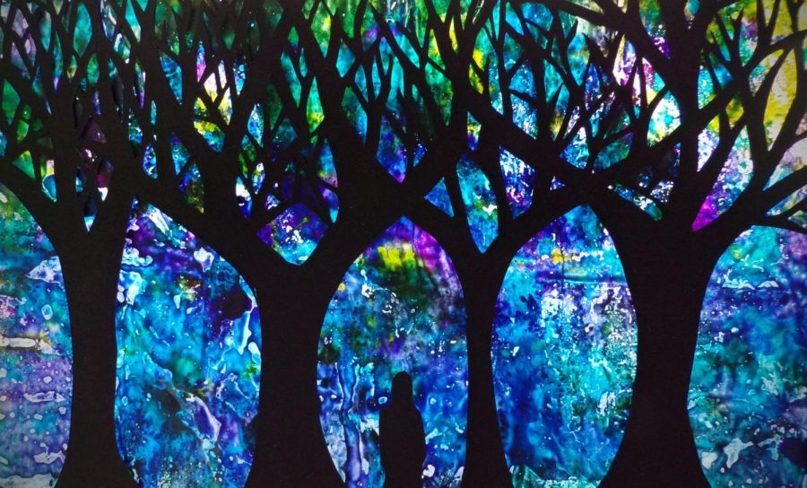
For as long as songs, poems, and stories have been around, people have been recording the “ruby red lips” of lovers, the “verdant green” of sacred forests, and the “inky black” of the night sky. Certainly this is true of poets, artists, and romantics alike.
Color is the language of art. It is the means by which we convey what we hold most dear and what we find most important. Saturated colors are used to send powerful messages, and pastels are used to convey safety and beginnings. Whether in language or in visual art, when humans are thinking of composition they are thinking of color.
Of course, as constant as the presence of color is in all forms of art, humans don’t all experience color the same way.
From the armchair philosopher’s favorite question, “Is your red the same as my red?,” to the not-uncommon genetic reality of colorblindness, there are countless nuances to the human experience of color. Even language is shown to vary as far as color is concerned!
Linguists have found that while every known language has some indication of color, color-based words vary greatly. Some languages only have two distinct color-related words (such as “dark” and “light,”) and others have no word for colors that are less necessary to describe, such as blue or purple.
But whether or not two people have words to describe the same colors, and whether or not they perceive color in the same way, there are still many ways humans experience color similarly.
For example, research suggests that color has a big impact on mood. Cool colors, like blue or green, are perceived as being much more calm than warm colors, like red or yellow. Knowing this, an artist can choose whether the calmness of their blue evokes melancholy or serenity, and likewise whether the energy of their red evokes happiness or anger.
The power of color is well known and used by artists of all kinds. Poets utilize red imagery to intensify a daring and lustful scene. Interior designers paint bedrooms and living rooms light tones of blue to create an air of relaxation. Flower arrangers use white blooms to represent refinement and modesty. And whether we notice it or not, we are soon surrounded by conversations written in the language of color.